Detroit Clutch leads the PWHL's new names, and Vegas missed
The PWHL named its four expansion teams Tuesday; the Toni Stone nod in San Jose is the best detail of the launch.
The PWHL went four for four on meaning and about three for four on names. Detroit Clutch is the best of the bunch, and it isn't close. Vegas Vanguards is the one I'd send back.
The league put names and logos on its four expansion teams Tuesday: the Detroit Clutch, the Hamilton Havoc, the San Jose Sea Lions and the Vegas Vanguards. That takes a league that started play on Jan. 1, 2024, to 12 teams. Season four opens Dec. 5-6, and all four newcomers debut that weekend.
Meg's order
1. Detroit Clutch. A car wheel that doubles as a clutch, chrome Art Deco lettering, and lines inside the wheel that read like a vinyl record for Motown. It sounds like the city, it sounds like hockey, and it carries a manufacturing history that a league built on its players' labor should appreciate. Black, white and red.
A team called the Clutch also gets a free headline every time it wins in overtime, which the marketing department has absolutely already figured out.
2. Hamilton Havoc. A peregrine falcon, the city's official bird, perched on steel-forged lettering. It's a nod to the mills sitting under the Niagara Escarpment. The colors are rusted steel, tempered gold and orange. Hamilton has waited a long time for a pro team of its own, and "Havoc" gives the building something to chant.
3. San Jose Sea Lions. The logo is a sea lion shaped like a wave, in coastal blue and sunset orange. The best detail of the whole launch is here.
The name also honors the 1946 San Francisco Sea Lions of the West Coast Negro Baseball Association, the team where Toni Stone started her pro career. Stone went on to play in men's professional baseball. That's a real piece of history stitched into a women's team, and it beats any mascot story.
4. Vegas Vanguards. A kit fox from the Mojave, with its ears forming a V.
The fox is great. The name sounds like a mutual fund advertised during a golf broadcast, which is not the energy an expansion franchise wants. Cactus green, desert gold and navy is a strong palette for a team that will still have to explain itself at the merch table.
The catch
Don't look for the new logos on the ice this winter. The branding wasn't done when jerseys were ordered, so the four expansion teams wear their city names across the front in year one. The logos go on sweaters in year two. Merchandise is on sale now.
That's perfectly reasonable. Nobody remembers an expansion franchise's inaugural sweater design; people remember whether the organization built a competitive roster.
The Ferda number
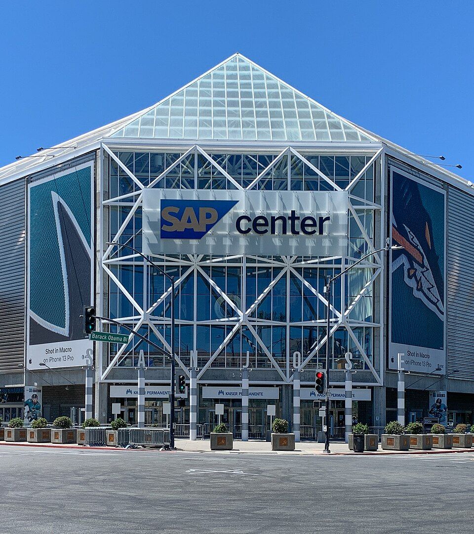
San Jose opens at home on Saturday, Dec. 5, at 4 p.m. PT against the Minnesota Frost at SAP Center. The building's NHL tenant, the Sharks, is 1-4 in its last five with a minus-10 goal differential, by our count. The Sea Lions don't need much to be the best team in that barn this month.
The W read
Three of these four names will age well, and the Toni Stone nod is the kind of thing the league should keep doing. The real test comes Dec. 5. A brand is a promise, and the rosters general managers assembled this fall have to keep it.